Showing posts with label Technology. Show all posts

15/09/2010

Electronic Battle Weapon

The Chemical Brothers began their 'Electronic Battle Weapon' series in 1996 so that fans and DJs could obtain the records that the duo had created with their own club sets in mind. Now ten strong, some of those tracks have since featured on official Chemical Brothers releases although, at the time of their issuing, they were very much part of an underground tradition of promotional material.

I wanted to propose a design for a hypothetical number eleven that would address a number of issues. Firstly there is the problematic nature of big selling artists maintaining those undergroud credentials. I put something in my report about the 'under-design' being used to suggest "a dependable realness" or what Redhead described as "a regime of truth" (Redhead 1993:121).

Particularly identified in subcultures that retain elements of exclusivity through the shared self-identification of being an outsider, there can be a rejection of anything approaching mainstream assimilation. In clubbing circles, this can manifest as a rejection of commercially-minded major labels. But the problem regarding a major label promoting material that it wants to be taken seriously outside of the Top 40-oriented demographic also related to my own desire to utilise QR-Codes within this project: as much as I love their pixelated nonsense and what they can do, they just seemed too corporate. So the idea here was to go back to a quote from producer Andrew Weatherall (who remixed The Chemical Brothers' first single, by the way) about the notion of the future as being this sleek, shiny techno vision. He believed that his 'future' aesthetic is one where the world is falling apart. I wanted to allow that to be used with this contemporary gadgetry. While also relating a proposal to the more underground design that is used to promote low budget, independent dance releases - the white label and the crudely applied stamp [figure 3]. So basically, after some deliberation, I wanted to revise the QR-Code as a deteriorated rubber stamped, monochromatic image across a 12" single.

For the vinyl itself, I went back to the laser-etching approach for a disc with one playable side. But the design was very much about going back to roots - albeit while acknowledging the year 2010 - so it additionally took layout inspiration from the pair's oldest 'Dust Brothers' releases through the Junior Boy's Own label. While it emulates the rubber stamp, given the size it is actually screenprinted using a pre-deteriorated digital image.

The B-side will feature a 'correctly' printed QR-Code directing users to a similarly rough looking Chemical Brothers microsite with all info, a MP3/WAV version, mailing list sign-up [for upfront details of new tracks] and a gateway to other currently available purchases including more general releases.


30/08/2010

Everything Everything - Man Alive

Manchester quartet Everything Everything obviously have design knowledge. (One of their singles was titled 'Photoshop Handsome'.) So it's perhaps because of this that the cover for the album that they're releasing through Geffen turns out to be pretty decent. I'm not sure who is responsible for the use of the interconnected broken typeface and the fox photo with the digital glitch details but it's a great combination of fairly unrelated elements.

Speaking of glitches, the band also got L.A.'s The Glitch Mob to produce a furious mash-up of the long-player that condenses it into just seven minutes. The label has been using this to promote the proper release via the downloadable/embedable [if that's a word] Soundcloud file featured below.

Everything Everything - Man Alive - The Glitch Mob Album Mash Up by EverythingEverything

29/08/2010

Ghostly Discovery for the iPhone

"A streaming radio station and mood-based music discovery tool, Ghostly Discovery is a free app for the iPhone and iPod Touch that lets you listen to the Ghostly International and Spectral Sound catalogs (full songs, nothing less) and share your favorites with friends."


From: Cool Hunting
Date: 22/07/09

Ever ahead of the music industry curve, Ghostly International today released its first (100% free) iPhone application, Ghostly Discovery, a slick listening app that uses mood-based tagging to generate playlists from the Ghostly International and Spectral Sound (its dancefloor-oriented arm) catalogues. Designed in conjunction with o2 creative solutions, Discovery represents a unique departure from the "if you like this, you'll like this" approach to streaming music. 02_PlayScreen-1.jpg

The steps to creating a playlist based on one's mood is pretty straightforward. After getting familiar with the seven mood colors in Ghostly Discovery, users can select a hue that meets their emotional state (yellow is energetic, for example), then toggle the digital/organic and faster/slower sliders. The app then generates a track listing based on these parameters. While tracks are streaming, users can tap the menu under the cover art to get an artist bio, favorite a track, or purchase it directly from the iTunes store. Once a user has registered his email with Ghostly Discovery, he can visit his collection of favorite tracks online and share these as a unique playlist with friends (this feature is super beta at the moment, as there is no way to delete or re-order one's favorites). 06_ArtistInfo-1.jpg

Curious to see how effective the song tagging was, I ran Discovery through a battery of mood tests. Introspective / digital / slow gave me a melancholic track by Solvent which met the parameters perfectly well, though was wholly inappropriate for the summer weather at hand. So I reset the indicators to energetic / organic and slightly fast. This gave me a Four Tet remix of Matthew Dear's Deserter. It seemed to be a pretty upbeat, sunny day selection, befitting my current mood. Eager to hear what an aggressive / organic / slow song sounded like, I reset the indicators once more and got a rather dark and menacing track by Twine. Lastly, I wanted to see what Discovery would dish out if I maintained complete neutrality. The first number, a Deru Remix from Lusine's Podgelism, was a meandering, chill tune—neutral, in fact.

Naturally, since Discovery just launched, there are a few improvements to be expected. One major complaint is that the playlists are always ordered in the same sequence. If you continue to set the indicators to frenetic / digital / fast, the playlist will open with the same track and proceed in the same order. While the application interface is both polished and subtle, some of the fields are difficult, if not impossible, to read in daylight. Finally, I would love to see a second generation that takes advantage of the iPhone accelerometer and flips the app orientation to a vertical layout.

Still, if there's one final word on Discovery, it's the chance to hear something new. I've been listening to Ghostly artists for about a decade now and thanks to this new app, I've just discovered 10:32, Australian Tim Koch's new project with Ghostly. What's my music mood now? Energetic.

Check out a brief Skype interview with Sam Valenti IV, founder of Ghostly International:


Cool Hunting: Why Discovery?

Sam Valenti IV: People are always asking me how to "find good music." Because of my profession, it's presumed that I know everything about indie and/or electronic music, but i don't. So I'd send them to blogs, Pitchfork, rcrd lbl, all good sites. But these sites still assume a good deal of knowledge. The least I could do is offer a solution that didn't ask a lot of the user and actually complimented their mood. So the mood-based tagging idea was born. This made it into a conversation with our friends at o2 in Detroit.

We were talking about doing a media project together, where people could use this tagging system to find music at kiosks (this was last year). o2 took this idea and shrunk it down to the app size, which felt really great, and it made sense as a way to let people find new music and either stream it passively (at work, at home) or to learn more, download, or "favorite" the music to create playlists of their own which they can download or share. It's like having a record store clerk in your pocket! (But all the music on the shelves is Ghostly).

There are more ideas on where to take this thing, but for now these are the vital stats of the app.

So you decided to start with the Ghostly catalog, which makes perfect sense, but are there plans to expand Discovery to include artists from other labels?

Yes. We wanted to of course start with our artists, get some feedback, learn what users want and be able to offer a free service to start. But we'd like to build a community with this app, starting with the artists we work with.

How on earth did you guys tag every song in the Ghostly catalogue?

We have a very hardworking and talented team in-house. : -)

To be sure... But what kind of metrics were used to measure the emotional content of the songs? The digital vs. organic and faster vs. slower is rather straightforward, but how did you guys come up with a rating system?

Well speed is scientific—bpm. Analog vs. digital is subjective. We did some tests where multiple people tag songs and we found fairly consistent results. Same with mood. There's a relative subjectivity to it, but the point is that it is subjective. It's our "opinion" of what the songs are. We didn't want a computer tagging these to start with, though as it scales, it might increase.

What does Discovery represent for you?

I see this app as a prescient tribute to the record store of tomorrow. One idea, amongst many good ones out there, to light the footpath for how music will be sold.


Creating Favorites on Ghostly Discovery from Ghostly International on Vimeo.


19/08/2010

Ian Wright - Printed Records

Originally known for his tribal-like illustrations for Straight No Chaser magazine's jazz-oriented favourites, Ian Wright's more recent work has explored the use of the pixel while building iconic images out of everything from badges to mascaras.

I was looking for an image that I remember seeing a while ago that employed the use of a TDK blank cassette but I couldn't find it. However, what I did find was these prints created by inking up records which, after seeing Tal Brosh's use of vinyl to emboss, was something I was going to attempt.

"Playfulness is important to me; I’m motivated by trying to push my work somewhere new. Somewhere else. Really, I’m interested in what could be. I sometimes reach that point by making mistakes and generally misusing technology and I often arrive at solutions by accident. I prefer to let the materials I use influence the outcome. I especially enjoy making portraits and I’m excited by the process of collaboration. I love conversation. I’m obsessed by music. I’m looking forward to what happens next."

Illustrator Ian Wright
http://www.mrianwright.co.uk/


Concave Scream artwork

From: Junk
Date: 22/05/09

Singapore's much-adored band Concave Scream recently released their fifth album Soundtrack for a Book, and have literally taken packaging to a whole new level by attaching the CD to a second hand book.

The nine-track, 43-minute release is entirely instrumental, and all 1,000 copies will come in specially selected second hand books, including dusty old ones from Enid Blyton, with the CD secured somewhere within the book with a bolt and nut.

The album is priced at S$20, and is currently available through online orders via www.concavescream.com (where you can customise your own virtual book), or physically via The Esplanade Store or at 2 Leng Kee Road, #03-02 Thye Hong Ctr, Singapore 159086 (near RedHill MRT). The band are gearing up for an album launch on 18 September at The Esplanade. For more updates and info, visit www.concavescreamband.blogspot.com.


18/08/2010

Warp.net redesign by Universal Everything

Warp has proved to be pioneering in the shift from more traditional media to the web. Its Bleep.com is a quality purveyor of forward-thinking music while Warp Records' own label site has been through a variety of different phases.

Previously Warp.net pushed an esoteric aesthetic perhaps in tandem with some of its potentially more difficult electronic listening material. However last year's redesign by Matt Pyke of Universal Everything brought in a more streamlined approach that reflects where the label is now: where its acclaimed independent film output is featured alongside a roster that has broadened well beyond its techno and electronica foundations. One important aspect was to increase the focus on the embedded media player while continuing the use of colour coded sections: a design mainstay throughout its various incarnations. Although this time it is a touch more subtle and the largely monochrome scheme only highlights the individual artwork from the various releases.


15/08/2010

Sharing, Physicality, Mixtapes and Newspapers

By: Russell Davies
From: http://russelldavies.typepad.com/
Date: 23/06/10

My talk at Lift seemed to go down quite well but I remember leaving the stage thinking of all the things I'd meant to say; my own fault for trying to cram an hour of stuff into 20 minutes. So I thought I'd try and elaborate on some of it here. This post is what I meant to say while standing in front of this picture of one of Roo and Leila's tapes.

Earlier in the year I'd heard Clay Shirky talk at SXSW - it was an incredibly helpful set of thoughts and had me thinking about sharing and physical stuff in a way that hadn't occurred to me before.

He referred to Why We Cooperate and talked about three modes of sharing and why they're different.

Sharing Goods - the hardest to do, because if you give a physical good you no longer have it, you're deprived of it.

Sharing Services - like giving helping someone across the road - you don't lose out on physical stuff but it's an inconvenience.

Sharing Information - like giving someone directions - you don't lose stuff, it doesn't take much time, no inconvenience.

And, crucially, he points out, we're taught all the time that sharing is good. We get hits of pleasure when we share things with people. It's neurological and social. We like to share.

So when Napster came along and changed music sharing from a Sharing Goods process to a Sharing Information process we didn't all suddenly develop criminal tendencies. It's just that sharing, which we're inclined to do, suddenly became way more convenient. And as he said and someone twittered "We have a word for not sharing if there’s no cost to you: that word is ‘spiteful.'" The music industry is not battling against a generation of digital criminals, it's fighting a bunch of kids doing what their parents have been telling them since they were two - sharing nicely.

That, to me, was a hugely helpful and accurate framing of what's going on with sharing on the internet.

But it also got me thinking along a tangent.

While talking about Sharing Services Mr Shirky mentioned mixtapes - a way of sharing your music without giving away your records, but not very convenient to make, a sort of intermediate step on the way to Napster. But having just seen Shift Run Stop's tapes of their episodes (so, I guess, not strictly mixtapes) I immediately started thinking not about the inconvenience of a tape, but about their embedded value.

A mixtape is more valuable gift than a spotify playlist because of that embedded value, because everyone knows how much work they are, of the care you have to take, because there is only one. If it gets lost it's lost. Sharing physical goods is psychically harder than sharing information because goods are more valuable. And, therefore, presumably, the satisfactions of sharing them are greater. I bet there's some sort of neurological/evolutionary trick in there, physical things will always feel more valuable to us because that's what we're used to, that's what engages our senses. Even though ebooks are massively more convenient, usable and useful than paper ones, that lack of embodiedness nags away at us - telling us that this thing's not real, not proper, not of value. (And maybe we don't have the same effect with music because we're less used to having music engage so many of our senses. It's pretty unemboddied anyway.)

And that made me wonder if that's why people are liking Newspaper Club so much? Are we getting close to some sweet spot where you get the satisfactions of sharing a physical thing but with the convenience of sharing information. Is that what you can get when you add Digital Sharing Technologies to Physical Manifesting Technologies?

We're not there yet. We're probably only at Sharing Goods like Sharing Services but even that seems like a step forward. Maybe that's why making your own book feels so right, maybe that's where we need to go next with DataDecs, maybe that's what Shapeways and Ponoko will enable, but I think there's something in this.

14/08/2010

Rethinking Album Artwork


From: PSFK

Date: 02/01/08


It is generally agreed in the music business that the “art” in album artwork died with the record format. With the advent of the cassette and the CD, the space an artist had to work with was cut to at least a quarter in size. With this reduction, we saw album covers change to merely a logo of the band or a simple photo of the band hanging around looking either as intimidating as possible or stylishly depressed. Then as we get to the digital era, our size has been reduced once again leaving everyone to think any chance for artistic expression is completely lost.

But let’s have another examination of the current digital album cover potential. The only time most any of us saw the cover art for a CD was when we initially purchased the album. Afterwards, that cover was practically never seen again being lost to a stack of similarly, seldom-seen CDs. Now as our CD stack gets replaced by expanding hard drives, album covers are once again being seen; even if this is on an even smaller palette. Yet, as the screen on our MP3 players grow, so does the space for album artwork.

Now here in this digital space is where things can get interesting. If you have an album of 10+ songs, why have the same cover for every song? If you’re a pop diva, show me 10+ different looks, outfits, and ways you run your scene. Give each member of your pop-punk band their own mug shot so we can admire the nuances of each disheveled
haircut. Tell a story as the album plays along. And while we’re at it, couldn’t we even incorporate animation into this space? Perhaps, show the dance moves to your latest track. If banner ads can be animated, why not album cover art?

There’s a world of potential with digital album cover art that is being lost. This idea isn’t about to pull the recorded music industry out of its downtrodden woes, but it could at least at add a bit of life to their product. This will require some changes from the online retailers, but it could give an edge to whoever takes advantage first.


-Contributed by Trey Shelton


The Future of Album Art

From: PSFK
Date: 16/04/08


While old-style album artwork is drawing its last breath, digital album art is taking on a life of its own. As Wired reported last year, there are a number of designers bringing advanced digital techniques to the operating table—online contests, liner-note fly-throughs and DVD-style menus, for example. George White Warner Music Group’s senior VP of strategy and product development, said:

“We’ve been looking at a few technologies (for digital album art), and have been trying to bring these to Apple, to encourage them to bring that level of experience to the iPod,” says White. “A very simple demonstration that we’ve done takes the Gnarls Barkley liner notes and does a fly-through (using Adobe Flash Lite). You’re actually moving through the lyrics and artwork. It’s sort of like a theme park ride through the album. It’s really, really cool-looking on an iPod.”

More recently, Wired pointed to a blog from London-based graphic designer Phil Clandillon called Sleevelessness, which documents and explores the changing role of graphic design and the web in promoting music. Clandillon recently pointed out the widget for Radiohead’s In Rainbows and Justice’s video for “DVNO”.

Now we’re noticing artists on MySpace using animated artwork to gain attention on the over-satured site. Zeegisbreathing points us to a band called Discovery (a side project from one of the members of Vampire Weekend) that is using a psychedelic flash-coded cover to stand out. @&*$*rw*#&we(@@#@…. Woah, sorry, we think we just had a seizure.

13/08/2010

Tal Brosh - Less Is Less/Less Isn't More

Amy reminded me about Tal Brosh's work and, in particular, forwarded me a link to Less Is Less and Less Isn't More: projects that explored design concepts based around developments in music distribution. I think Brosh's stance was that the download was a potential threat to both visual music accompaniment and traditional listening practices. This was highlighted throughout a broad range of work.

More work at http://www.talbrosh.com/

From Less Is Less:
"Although to begin with the album was almost an arbitrary model, its journey as the carrier of music over the past 60 years has shaped our consciousness as a social and cultural object. 'Less Is ' is a large-scale book that illustrates different aspects of the album decline in the digital age, using engaging visuals to create a certain rhythm and playful narrative."
From Less Isn't More:
"The nature of digital music and ‘per song’ marketing has resulted in a dramatic transformation of the single market in the past six years.
In the information age unlimited availability makes consumers more likely to get fastidious but what does this ‘cherry picking’ do to the music and the way we precieve it? This book offers a visual represetation to the way we listen to music these days."

There's also a further Tal Brosh project that is an experimental music packaging project that takes a concept in some really interesting directions. While I'm looking at the subject from a different standpoint, the more destructive methods used are especially interesting to me right now.


12/08/2010

The iTunes Icon: How Do We Represent Post-Disc Media?

From: PSFK
Date: 08/07/10

Last week, Gizmodo’s Matt Buchanan mused how little iTunes in 2009 has to do with the CD icon we click on to launch it—Apple’s original “Rip. Mix. Burn.” promotional slogan seems so antiquated today.

The laptop this very post is being composed on has had its CD-RW drive used only once or twice since it was purchased at the beginning of this summer—perhaps poignantly, a CD placed inside and forgotten was recently removed because of the annoying spinning noise it created every time iTunes was started; the disc was not a medium but an irritation. So Buchanan asked Gizmodo’s readers to re-imagine iTunes’ disc and music note icon design for an era in which compact discs are used only by the Luddite, the stubborn audiophile, or the moping young man hoping to win back his ex with a mix CD. At this point, iTunes handles not only music, but our photos, television episodes, movie rentals, mobile contacts, and other sundry media duties. Let’s not forget what the purpose of graphic design is within the context of the desktop or dock—the icon should convey the utility of the program in a way that catches the eye with familiarity and conveys its own meaning clearly.

The results of the icon contest are a mixed bag—mostly joke entries, though a couple seem good enough to be viable replacements.


11/08/2010

Martin Skelly's Playlist Player

From: PSFK
Date: 10/05/10
Link: Press release


UK based digital product designer, Martin Skelly has created the Playlist Player which plays back digital files by mimicking the classic revolving ritual of a vinyl LP.

Martin explains its design and working:

There are two parts to the design: the player, and the record box containing five different colored covers. Once the playlists are chosen and synced to the player with a memory stick, the user customizes the outside of the sleeve with artwork of their choice. It could be photos of a memorable night or person or typed and hand drawn tracklists. Once the record is placed on the player, the music begins and the outer ring of lights illuminates. As the playlists plays rings of light visible through the translucent record move towards the centre of the disc, like a needle tracking on a record. These lights represent time and not the number of tracks, meaning your music must be enjoyed from start to finish with no distractions like the temptation to skip tracks, fast forward or rewind.


Martin says that nowadays, people tend to rush and skip through their digital music; his Playlist Player brings back the old charm of listening to the whole music album without having the distraction to skip tracks.


Arcade Fire's Synchronised Artwork

From: CR Blog (and forwarded by Amy)
Date: 11/08/10


Back in 2007, director Vincent Morisset reinvented the music video online, with his interactive promo for Arcade Fire track Neon Bible. For the band's latest album, The Suburbs, Morisset has now turned his attention to how digital music files could be more visually exciting...

Morisset has worked with designer Caroline Robert to create a digital artwork that appears when the album is played on mp3 players like the iPod or iPhone. The work deliberately echoes the pleasures of old vinyl record sleeves, where the song lyrics were often written out in full. Each track on the album has an individual image that appears on the iPod screen when it is played, with the lyrics of the song then appearing on the screen as they are sung.

"Win [Butler, Arcade Fire's lead singer], wanted to create a version of the artwork that would be relevant in the digital world," explains Morisset on his website. "Most of us now buy, share and listen to music through computers and portable devices. It seems absurd that it is still a single jpg that is attached to an album in 2010."

"I thought about the relation we have with the vinyl cardboard cover or the paper booklet while listening to the songs. Flipping through the lyrics, looking at a band picture or a cool drawing related to a song while listening to it. With the mp3 player, we lost that. I wanted to find a way to get closer to that experience again."

As with his Neon Bible video, part of the success of the Synchronised Artwork is its simplicity. Explaining how it works, Morisset says, "Tightly sync a series of images with specific moments in a song using the m4a format. Like some podcasters do, but with micro chapters for each line of the lyrics. In addition to that, we were able to add good old hyperlinks also synchonised to the song. This gives the possiblity for the band to add, at any moment, all kinds of references related to each song. They plan to change and update those links occasionally."

The handwritten presentation of the lyrics on the screen works perfectly with the artwork that Caroline Robert designed for the album, which includes photographs shot by Gabriel Jones in the suburbs of Houston. To experience the Synchronised Artwork for yourself, head online to arcadefire.com, where it is included with the purchase of any digital download of the album.


Jeff Mills - 'The Occurrence'

Before vinyl enthusiasts started bitching about MP3s, CDs were often cited as a bugbear.

Techno deity Jeff Mills may be a turntable maverick, yet he recently united the two formats in one product. 'The Occurrence' - a CD/Vinyl hybrid released as part of his 'Sleeper Wakes' series - has two playable sides to appease both analogue and digital fans.


10/08/2010

Frank Bretschneider - EXP

From the Raster-Noton label [although maybe more relevant to the previous project]:

EXP is a music-visual work based on the idea that fine art should attain the abstract purity of music. an attempt to assimilate the qualities found in music – including movement, rhythm, tempo, mood, intensity and compositional structure – within visual phenomena. the music for the project was composed of specifi c generated and selected waveforms, feedbacks, impulses, clicks, the sound of mechanics, electricity, magnetism, light and other radiation. in addition and since the animation is mainly driven by sound frequency and intensity, the sonic quality of these sounds makes it possible to obtain an optimal effect on the graphics motion. in combination with several other ways of controlling the animation – from midi programming to applying motion curves – the visualization represents an exact reproduction of the audible occurrences. as a consequence the computed images often attain anunexpected beauty, from simple geometrical patterns to extraordinarily complex forms.


09/08/2010

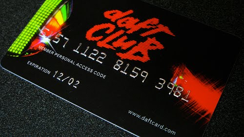
Daft Punk's Daft Card

I previously wrote an essay about Daft Punk's use of visual forms. Specifically it dealt with the representation of man as a robot. And I do really like how the duo creates high-profile work while playing around with notions of anonymity: sometimes I enjoy how it works conceptually more than what they do musically.

While the French twosome has consistently dabbled outside of traditional music formats with everything from animated films to coffee tables via a Gap commercial, I was always impressed by the 'Daft Card' that came with copies of, second album, Discovery. This gained entry to 'Daft Club': an online resource that allowed for the download of bonus material including extra tracks and remixes. It is telling that this was devised in 2001 as, the first available track, 'Ouverture' begins with the stupid electronic noise of a dial-up connection and remains a testament to the technology of the time [this content has since been released seperately as 'Daft Club', by the way].

The use of the credit card as a physical form also lends itself to discussion regarding the commodification of music yet - let's face it - it was still a handy little object that also fitted neatly into your wallet.

Laurie Anderson quote

"Technology is the campfire around which we tell our stories."


[Thanks to Tash for forwarding this.]

Kitsune Noir Mixcasts

Art and design blog Kitsune Noir has been offering its compiled music 'Mixcasts' for a while now. Each comes with artwork. Yet as a digital download, it doesn't actually require any more than a text track list but it could be argued that the imagery allows the opportunity to build on the theme of the compilation itself with something substantially more evocative. However, I would suggest that the proportions and layout needn't follow the same template of a CD version given the freedom of a non-physical release. These, while beautiful, do seem to conform to some agreed idea about what a tangible music format should be.


08/08/2010

iTunes artwork

There's a counter argument to the suggestion that the MP3 has meant music artwork is in decline. The fact that the average iPod now carries around the thumbnails for files means that the music purchaser is now more likely to have immediate access to an associated image. In many cases, they are literally inseperable. And, should they become detatched, a product like Amphonic Designs' Album Cover Finder resets that connection between the audible and visual. Thanks to Nicola for the tip-off.

Peter Gabriel's Scratch My Back Album - deluxe edition designed by Marc Bessant

Dave sent this my way a few weeks back and it's a lovely bit of packaging by Marc Bessant with art direction by Daniel Mason. This format for the most recent Peter Gabriel album features CD, vinyl and USB plus a limited print signed by Peter Gabriel and it retails at $299. There are just 500 copies. [Full details at http://www.petergabriel.com/scratchmyback/]

It is interesting that even basic vinyl copies of chart albums now come with premium pricing and are only available in limited numbers. But as this multi-format version highlights, often the releases aren't about the playability of the music itself. The collectability of the product is potentially more important.