11/08/2010

Potential ideas to explore

This change of direction for this final major project has meant that I've not had the luxury of time to allow a lengthy experimental stage. With previous projects, I've tended to see what comes out of various processes to inform some kind of deliverable. With just over a month to complete this, I need to be at a stage where I'm ready to move into a more considered approach to the output to maintain a certain amount of freedom to fully explore the potential aesthetic solutions.

So right now I'm considering a number of different directions. All of which are the result of the rationale I've been refining.

One is to argue the relevance of format to music in the digital age with a series of 'unplayable' music forms. As with the Matthew Dear 'Totem', the format itself is simply a collectable visual object with the audio content via streaming or download. The use of unplayable media is, for me, a logical conclusion for where music retail is going and is seemingly a more potent yet actually quite abstract piece of ephemera that might question the current music buying habits within this particular era. I can already see a number of interesting routes for this and have a selection of associated visual references that I'll post as soon as I have chance.

A second option is a series of print-based items that exalts digital media by exposing how traditional music formats have been wrongly defined as the actual music. I knocked up the quick image below as a marker for this approach although I'd suggest a broader interpretation of the concept. I also need to check on the availability of various print facilities before going too far down a particular route.

The third was an idea that looks to exploit the fetishism for music formats in a visually communicative way. To highlight how vinyl hunger in particular verges on the pornographic. This is the one that I'm less sure about although I was thinking it could be a fairly tongue-in-cheek series that looks to play on that desire.

There's a fourth option which would be to use all of these in some way and build something approaching a campaign that uses the various elements to contribute to a dialogue about the concepts of music, formats and meaning.

Barnbrook Mixtape 1988

From Jonathan Barnbook's blog:

"If you are of a certain age you will remember ‘the mixtape’ – a cassette tape you made with a personal selection of music. These amateur DJ efforts were for many purposes, sometimes to get a party going were you arrived at a very sober occasion and proclaimed you could liven up the place with the magic ingredient of ‘the best party mixtape ever (usually starting with James Brown's ‘Sex machine’ and following with a selection that wouldn't have been out of place at a bad wedding reception). Some mixtapes were to woo girls clearly showing ‘what a sensitive caring guy you were’; and you hoped that subliminally recording ‘please sleep with me’ in a whisper in the quiet bits of the tracks would guarantee you some kind of success with them. The final category were much more dark in intent; part of a wider evangelical mission you had to convert the whole world to the music and sub-culture you were almost religiously part of.

So, recently Richard Squires, an old college friend contacted Jonathan with some rather professional images of an example in the third category (thankfully), that Jonathan did for him when they were both at St.Martins in 1988. We don't think it is the most amazing piece of design he has done but they do serve to show the intensity of Jonathan as a student – that he was prepared to go to such design lengths to simply give a friend some music he liked, especially since he has has cited record covers as one of his biggest influenced on him becoming a graphic designer. Also on seeing this we are lamenting something human that has been lost in the iTunes playlist or Spotify link."


This wouldn't have happened on iTunes

Both Dave and I spotted this on the CR Blog yesterday: a Soho record store dumped a load of vinyl in a skip. Subsequently this prompted one of the biggest bargain bins the Capital has seen.

However, I watched the video and felt a little bit sad. Firstly because all of that specialist jazz and classical music was thrown-out so unceremoniously [due to the shop itself undergoing a refurbishment]. I'm sure that another retailer or a committed collector could have offered it all a more appropriate home. Plus vinyl can also be recycled. But the thing that really got me was how undiscerning the crowd appears to be. Sure, some people appear to be sifting through it as if they're looking for something specific, but generally it feels like a bit of a melee where the material is grabbed with little discrimination. It smacks of its desirability being dictated by vinyl's assumed collectability rather than any need to hear the music itself.

10/08/2010

Frank Bretschneider - EXP

From the Raster-Noton label [although maybe more relevant to the previous project]:

EXP is a music-visual work based on the idea that fine art should attain the abstract purity of music. an attempt to assimilate the qualities found in music – including movement, rhythm, tempo, mood, intensity and compositional structure – within visual phenomena. the music for the project was composed of specifi c generated and selected waveforms, feedbacks, impulses, clicks, the sound of mechanics, electricity, magnetism, light and other radiation. in addition and since the animation is mainly driven by sound frequency and intensity, the sonic quality of these sounds makes it possible to obtain an optimal effect on the graphics motion. in combination with several other ways of controlling the animation – from midi programming to applying motion curves – the visualization represents an exact reproduction of the audible occurrences. as a consequence the computed images often attain anunexpected beauty, from simple geometrical patterns to extraordinarily complex forms.


Work by Non-Format

There's already a picture of Non-Format's Red Snapper artwork on the Hard Format post but, looking through their portfolio, there are so many perfectly realised music projects. The sort of stuff that would make it worth trekking to the shops for.


Fabrice Lig - Genesis of a Deep Sound

Compared to some of the more luxurious packaging I've posted, the artwork for techno producer Fabrice Lig's Genesis of a Deep Sound long-player might be seen as fairly standard. A collaborative effort by Edit (creative production) and Sawdust (art direction and design) with photography by Andrew Moore [who supplied visuals from his book Detroit Disassembled], it does feature a really nice inlay, 180 gr vinyl and two locked grooves.

What especially drew me to it is how it seems to follow on from Paul Rand's Mechanized Mules of Victory project [bottom two images]. I'm not sure if this is coincidental but Rand created a book that looked at what the American car industry was doing for the war effort while Moore's photographs highlight the dereliction of that same industry after the Second World War. On a more basic level, the use of yellow and black also links these two projects.

I'd like to think that one has had an influence on the other but then I'm quite happy for them to be linked by accident too.


That's Cool But Can You Make It More Sh*t

DFA Records' art director Michael Vadino has seen much of his work displayed as part of That's Cool But Can You Make It A More Sh*t: a retrospective of the label's visual material in Australia. (The exhibition will eventually be travelling to London and, home city, New York.) It featured a selection of material including cover art, flyers, drawings, posters, photos and other promotional material. [You can see Jason Munn's LCD Soundsystem poster also displayed in the pic below.]

At a time when many are discussing the divorcing of music from its artwork as equating with its demise in the digital era, we have events like this that do much the same while actually championing the visual material.

There's an interview with Vadino at www.thevine.com.


Warp20 box set

I mentioned the supposed ubiquity of particular designers to releases by specific labels earlier when noting what Vaughan Oliver is to 4AD and Peter Saville is to Factory. Last year's Warp20 artwork is a bit of an anomaly as it wasn't created by the intrinsically linked Ian Anderson of The Designers Republic. Instead YES did a very fine job of packaging a selection of must-have material from the seminal Warp Records. Everything from those esoteric images to the splashes of purple to the often subtle introduction of text is in keeping with representations throughout the label's 20 year history. [The inclusion of 'locked grooves' on the vinyl also has personal appeal as it is about using a format for its potential capabilities rather than just being a nod to sentimentality.]

While these editions sold out quickly, the mobius band-based photographic work (by Dan Holdsworth) has since been released as four collectible prints in an edition of 100. Price £65 each or £250 for the set. Music not included.


Hard Format

"It seems like everybody’s talking about the end of physical music
media. Who knows whether they’re right or not, but Hard Format is a
little place we’ve set up to celebrate our love of brilliant
music-related design. That means we’re going to focus on records, CDs,
cassettes and their like. However, Hard Format isn’t intended to become
a dusty museum devoted exclusively to past glories, though there’ll
certainly be some of that, we also want to highlight the brilliant new
design work being produced right now. In fact, we’re not setting
ourselves up to supply a canon of classic design - this is a place
where we record stuff we like, if you want yet another reproduction of
Sergeant Pepper’s Lonely Hearts Club Band there are enough ‘Greatest
album covers of all time’ books out there already."

Hard Format is a collection and study of the design and art of physical music media and it's packaging. Not just another collection of album covers on the Internet, Hard Format embodies a love for the music-related design of CDs, cassettes and vinyl.
I specifically like the material that moves away from the supposed restrictions of the traditional format but then I can also recount how some of my own music purchases - such as Mo Wax and Spiritualized releases - would be a little annoying as they wouldn't be easily stored due to their increased size. Shop-bought CD racks, for example, never had the capacity for 'deluxe' editions.


09/08/2010

Daft Punk's Daft Card

I previously wrote an essay about Daft Punk's use of visual forms. Specifically it dealt with the representation of man as a robot. And I do really like how the duo creates high-profile work while playing around with notions of anonymity: sometimes I enjoy how it works conceptually more than what they do musically.

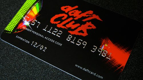
While the French twosome has consistently dabbled outside of traditional music formats with everything from animated films to coffee tables via a Gap commercial, I was always impressed by the 'Daft Card' that came with copies of, second album, Discovery. This gained entry to 'Daft Club': an online resource that allowed for the download of bonus material including extra tracks and remixes. It is telling that this was devised in 2001 as, the first available track, 'Ouverture' begins with the stupid electronic noise of a dial-up connection and remains a testament to the technology of the time [this content has since been released seperately as 'Daft Club', by the way].

The use of the credit card as a physical form also lends itself to discussion regarding the commodification of music yet - let's face it - it was still a handy little object that also fitted neatly into your wallet.